Rob Minto

Sport, data, ideas

Month: August 2011

The crazy cost of Switzerland

I’ve just got back from a long weekend in Geneva. Lovely place, beautiful lake, painful exchange rate. Switzerland was always quite expensive, but with the Swiss Franc a safe haven for investors, hanging out in Geneva suddenly looks like a small fortune.

But leave aside the cost of normal stuff like food and hotels for a second. We were staying with friends for part of the trip who live very near the border with France, so I got text messages alerting me to what mobile services would cost from my telco (T-Mobile) in either country.

[easychart type=”vertbar” height=”200″ width=”350″ title=”Mobile prices, price(£)” axis=”both” groupnames=”France, Switzerland” valuenames=”Make call, Receive call, Text, Data per mb, Picture msg” group1values=”0.366, 0.115, 0.115, 0.333, 0.2″ group2values=”1,1,0.4,7.5,0.2″]

And what a difference half a kilometer makes – over in France, it was 36p per call, and 11p to receive a call, compared to £1 in Switzerland. A text in Switzerland was 40p to 11p in France. Weirdly, picture messages were the same on both (20p).

But it was data where the greatest difference lay. In France, I was offered £1 per 3mb. In Switzerland, it was £7.50 for 1mb – over 22 times more expensive.

Now I know that EU regulations are bringing down the cost of call and data roaming in Europe, which Switzerland is free to ignore. And this is a sample of one, rather than a proper survey. But data should never, ever cost 22 times more just by walking 500m across a border.
What if cricket counted centuries differently?

Alistair Cook’s 294 against India got me thinking today – why does 200 not count for 2 in the 100s column in a batsman’s career stats? And if it did? How would the stats look then?

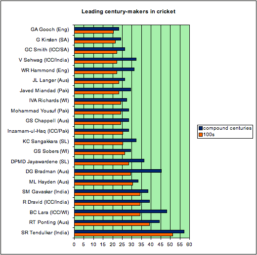
Going from 99 to 100 may just be one run, but it’s the milestone. So why not 199 to 200? It’s the same achievement, 100 consecutive runs in one innings. So the chart below shows how the century list would look if scores over 200 counted as 2 centuries, over 300 as 3, and Lara’s 400 as 4.

In this chart, the accepted number of centuries is in orange, and the compound counting of 200s, 300s and 400 is in blue.

The first thing you notice is that although Tendulkar is still in top spot, his lead is cut, and he hasn’t got too many “big” scores compared to others.

Second – the big beneficiaries are Lara, who leapfrogs Ponting, and Bradman, who gets a huge boost. Sehwag and Hammond also move ahead of rivals, as do Sangakkara and Jayawardene.

Here’s the best list for data: Cricinfo – double hundreds, triple hundreds. And here’s my big100s spreadsheet.

As ever, it just confirms that Bradman is the best of all time. But it also would reward the effort of getting from 100 to 200. Time to change the counting system, I think.

The perils of comparing the greatest at different sports

It could almost be a sport itself – debating who is the greatest sportsman of their sport / generation / all time. The great names are easy to think of – Pele, Federer, Bradman, Woods. Or is it Maradona, Laver, Tendulkar, Nicklaus?

The arguments will rumble on, but a few statistical caveats should always be kept in mind. One is: You can’t compare between sports very easily.

Here’s an example which has made me furious. In a recent issue of Prospect magazine, Jay Elwes tries to make the case for Indian cricketer Sachin Tendulkar being the best sportsman in the world. Fair enough, a good candidate I’d agree. But just read the following paragraph:

At which point, a question arises: can Federer, perhaps the greatest ever tennis player, be measured alongside Tendulkar? One instructive comparison is the distance by which each leads the trailing pack. Federer has won 16 Grand Slam tennis titles. In second place is Pete Sampras on 14, which makes Federer 14 per cent more successful than his nearest competitor. Tendulkar has scored a total of 32,803 runs for India in Test and one-day internationals combined. Ponting, in second place, has scored 25,769, meaning that Tendulkar has scored 27.3 per cent more again than his nearest rival. His lead is nearly twice that of Federer.

I’d like to say this is a small blip, but it’s not. It seems to be the main data to buttress his argument. What’s wrong with this? In no particular order:

  • Why are total runs so important? Tendulkar is great, but he’s played more matches than anyone else too in both tests and one-day internationals.
  • How on earth can you make sense of a “percentage lead” when the range is 0 to 16? And compare it to a measurement system with range 0 to 30,000 plus? Idiotic.
  • If Federer wins the US Open next month, that puts him 21 per cent more successful than Sampras, up from 14 per cent. And the point is?
  • Comparing grand slams to runs is just bonkers. You accumulate runs, win or lose. You can’t do that with grand slams.
  • Why not compare total tennis match victories to runs? Or test match wins to tournament wins? It would be a more like-for-like comparison, although similarly meaningless.

I could go on, but you get the idea.

Cricket and tennis lend themselves to some fascinating statistical analyses. But this is not an “instructive comparison”. It’s grossly misleading, shows little thought, and does the debate about great sportsman no favours. Prospect magazine is a superb publication, but this is not one of their better articles.

Big data is underestimating the emerging markets

Consultants and analysts – and bloggers, of course – are keen to tell us how big the world’s data is, and how fast it is growing. We have entered the “zetabyte age”.

But for all the talk of “Big data” and how daunting it all is, I think data levels are going to be far bigger than we estimate now. As far as I can tell, most of the models of data usage look at developed markets, and extrapolate the phenomenal growth in data from use of smartphones, PC usage, companies etc.

But this underestimates the usage of data in the developing world. Many countries are going to run straight through the non-networked, 2G world and join the data-everywhere, cloud-based, streaming world instead. And this has big implications for data.

The EMC Digital Universe infographic (pdf) suggests exabyte growth of the total world data from 1,227 in 2010 to 7,910 in 2015. Although this looks like a huge increase compared to 2005 to 2010, when world data was estimated to go from 130 exabytes to 1,227, the actual rate of growth they predict is slowing, from a factor of 9.4 to 6.4.

Instead, take a look at the McKinsey report into big data (pdf).  On page 103 we can see a rough breakdown of data storage by world region. If we take North America as the target level, that region uses 6.5 petabytes per million people. Run the rest of the world at that level of data usage, and the world total of 6,750 petabytes goes up over 5 times to 37,296 petabytes. See table below.

Now the rest of the world isn’t going to catch the US in the next 5 years in terms of data usage, but you get the idea of the scale of this. China is currently on 0.2 petabytes per million. India is even lower. Working on models of developed countries is fine for now, but the rest of the world will catch up faster, and use far more data. I’d rip up a few of those models and predictions and start again.

Region Petabytes Population (m) (Source: Wolfram Alpha) Petabytes per million people Petabytes assuming North American data usage Percentage change
North America 3,500 538 6.5 3,500 0
Latin America 50 589 0.1 3,832 7,564
Europe 2,000 595 3.4 3,871 94
China 250 1,350 0.2 8,783 3,413
Japan 400 127 3.1 826 107
MENA 200 599 0.3 3,897 1,848
India 50 1,210 0.0 7,872 15,643
Rest of APAC * 300 725 0.4 4,717 1,472
Total:
6,750
Total:
37,296

* Rest of Apac population taken from Wikipedia, with Japan, China (incl HK and Macau) and India removed.

© 2024 Rob Minto

Theme by Anders NorenUp ↑