Rob Minto

Sport, data, ideas

Category: Data (page 3 of 3)

Good, strange and seasonal – the name game

The recent birth of my third child (a girl, all good, thanks for asking) meant another stab at picking a “good” name.

By good, I mean a name that ticks a few of these random boxes: not too popular; not too weird; sounds nice; no major associations; works with the other names we picked; doesn’t create a stupid acronym. That sort of thing.

And being something of a data nerd, I of course turned to the top list of baby names provided by the ONS. I’ve mentioned before the curiosity of names, and the readable analysis in freakenomics is fascinating.

However, a few things in the top girl names [xls file] (2009, the most recent list) struck me.

A quick test: our children are called Matilda, Francesca, and Annie. In 2009, the most recent data, which was the most popular? I would have thought Annie, but it was actually not even in the top 150, coming in at 153. Francesca was 98, Matilda at 46.

Weirdly, the names Lexi (47) and Lexie (69) – which count as separate names – when added together get into the top 30 with over 2,000 registrations. But the most notable thing about Lexi(e) is that it has risen from nowhere – in 1999 both variations barely got into the top 2,000 names.

But buried lower in the data was the confirmation that naming children can be terribly contrived. For nine months of the year, the most popular names are as you might expect. But then in June and July, Summer appears in the top 10. Overall in 2009, it ranked 24th with 2,054 girls given that name. But June and July saw 608 of those, nearly 30 per cent of the total. I’d guess it’s close to the top 10 for August too.

In December, it’s even worse. Holly, a name that over the year ranks 19th, is top in Christmas month, with nearly 23 per cent of its registrations, (519 of 2,263). It doesn’t get in the top 10 for any other month. Basically, if you meet someone called Holly, you have a 1 in 4 or so chance she was born in December.

Without wanting to sound too clever, I think we’ve picked good names. It’s a tricky dilemma, and you want to be creative without ending up like Daisy Waugh – Panda, Zeberdee and Bashe might be “different”, but it’s a fine line.

Finally, scrolling down to the very bottom of the list to the names given to only three girls nationally (names given only twice or less are redacted) throws up the truly awful. Porsche? Lilo? Topsy? There must be some corkers with only one entry.
Will debranding cigarettes cut smoking?

Today, March 9, is national no-smoking day (in the UK). Coincidence or not, it has also been announced that tobacco displays will be banned in shops, with the further possibility that cigarettes could be sold in plain packets.

Will this debranding help cut smoking? Because that’s what we want to do, I assume. Without an outright ban on smoking, which is still seen as a step too far, making smoking harder to do and less attractive to buy is the next best thing.

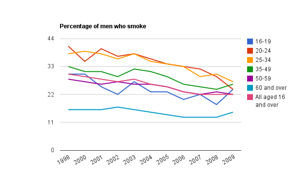
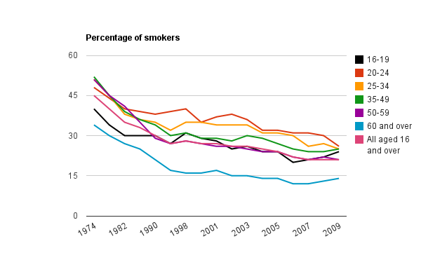
Leaving aside the costs of removing tobacco displays and other marketing bits and bobs, is this helpful? To understand what’s going on, we need to look at what has happened to smoking rates in recent years. The most recent ONS data is from 2009. (See sources at the foot of this post).

Basically, as seen in the chart above, it’s been on a downward curve, albeit one which has recently stalled. The downward curve is good news. The stall is not. Either the stall is temporary, or we have hit the ceiling (or floor, depending which way you look at it). The data is partial – 4 year intervals up to 2000, but you get the picture.

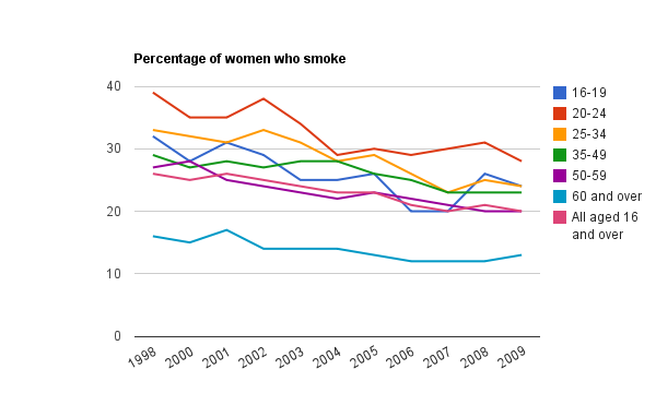
But dig deeper into the numbers, and you can see that, actually, people are still giving up smoking. All except one group: 16-19 year-olds. (Well, with a few blips here and there. There’s been a slight increase amongst the 60+ too.)

There was first a jump among women aged 16-19, and then the following year among men. (Trying to impress? Sounds familiar. Anyway…)

The uptake among 16-19 year-olds may be attributed to all sorts of things: rebellion, lack of education about smoking-related illnesses, doing the opposite of what your non-smoking parents do, fashion. Who knows? Even if you could ask every teenager in Britain, they would probably lie anyway*.

So: is debranding cigarettes a good idea?

FOR: teenagers are brand-aware, impressionable, and irrational. Removing tobacco imagery, with it’s intriguing logos and cool branding can only help. If you want to reduce smoking in the group where it’s on the increase, removing branding is a good move.

AGAINST: if there’s one thing that guarantees some level of intrigue and “cool”, putting things under the counter and in groovy plain brown paper is it. Teenagers will love the speak-easy status of cigarettes, the added bit of mystery. Brands aren’t really cool – teenagers are, and the whole no-logo thing will only help.

Sadly, I have no data to back any of that up. I’m sure there are tons of marketing studies that could prove it either way. The only measure will be whether smoking decreases or not, and as I mentioned before – statistics tell only what people are doing, not why.

Sources:

ONS: Smoking-related behaviour and attitudes

Results from the General LiFestyle Survey (GLF)

ONS: PDF – General Lifestyle Survey 2009 Overview, Table 1.1, p16

* I was a teenager once, and I lied about stuff.

China: the new home of the skyscraper

In my last post I talked about how London is getting a new clutch of 200m plus buildings. But then I thought – where are the biggest buildings around the world now?

In the past, New York was always regarded as the tall-building capital of the world, and held that reputation even though the Willis (formerly Sears) Tower in Chicago was the tallest building in the US. Hong Kong has always been a tall city, given the pressure on land space. And after that, a few smatterings of tall buildings in Asia held the world’s tallest title – the Petronas Towers in Kuala Lumpur, followed by Taipei 101.

Then came The Burj in Dubai – significanty bigger than anything else by some distance, at over 800m (Taipei 101 is around 500m).

And yet – the country that leads the way is China. A list of the top 100 tallest buildings in the world (completed, not in construction) shows that China has 32 – just shy of a third. Next is the US with 28. The UAE has 17. That leaves the rest of the world with only 22.

And the Chinese surge is amazing – 23 of China’s 32 were completed since 2000. As for New York, of its seven buildings in the list, four were built in the 1930s. That’s a bygone if golden age. Overall, 55 of the top 100 were built this side of 2000.

And where are the next clutch of buildings being built? India, Saudi Arabia, and of course, China. Three of the top five buildings under construction are in China, and it has five buildings under construction that will top out at over 500m.

Every so often China takes over something as the world’s most or biggest: most internet users, overtaking Japan as the second biggest economy (read Gavyn Davies for the best analysis of the economy issue). In skyscrapers, China may not have the tallest, or even the most iconic, but in sheer volume it leads the way.

The ever-expanding list of new countries

There have been a lot of articles about south Sudan becoming the world’s newest country, often with a slightly breathless tone as if it were as rare as a solar eclipse. But how often does this happen? Is it so rare to see the birth of a new country?

In some ways, yes, in others no. Yes, because there are only 190+ countries in the world or so, which means one addition is still significant numerically. No, because new countries appear more regularly than say, the Olympics, and the 20th century saw an explosion of new countries unlike any time before.

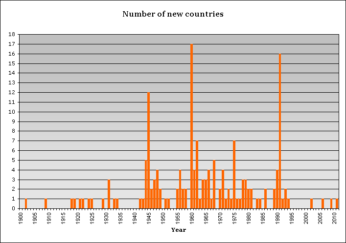
Here’s a chart of new countries since 1900. It’s got a few anomalies, such as Iraq in 2009, which seems odd as most people would consider Iraq to have been a country many generations prior to the US-UK invastion, but the data uses the year when the country is free from subordination, which works for most countries.

There are three big bursts: in 1945 after the second world war, where much of Europe was released from Nazi control; in 1960 as many African countries seceded from or were granted independence by France; and in 1991 as the Soviet Union and Yugoslavia collapsed.

Here is the source (Wikipedia), and here is all my Excel crunching.

So is Sudan so remarkable? It is certainly interesting, and unusual given the circumstances – it isn’t the end of a big war or collapse of a superpower. But this is not a once-in-a-generation event, and there will be more to follow. Scotland? Alaska? Who knows, but I’m sure it won’t be too long before we see the UN country count at over 200.

Facebook: is the party over?

In all the hoopla surrounding the Goldman Sachs investment in Facebook, one thing seems odd.

It isn’t the money – Facebook made $2bn in revenues last year, apparently, which isn’t bad (although we need to remember that revenues aren’t profit – finance 1.01).

And it isn’t the ambition – Facebook is making itself the de facto log in for half the web. Nor is it platform issues: people look at Facebook on iPhones, Android phones and so on.

It’s the traffic.

Facebook is first and foremost a network. And the laws of networks mean that the more people join, the more useful they are, and the more connections are made. It’s exponential – just think of the moment when 2 people are on a network, and a third person joins – the number of possible connections doubles each time.

Now look at these charts – they are from Wolfram Alpha, who use Alexa as their source.

The number of users just keeps growing:

Facebook users, 2010

Facebook users, 2010

But the traffic doesn’t:

Facebook pageviews, 2010

Facebook pageviews, 2010

You would think that the traffic would mirror the user growth. In fact, given the network effect, it should outpace it.

So what’s going on? Either Facebook’s new users are dud accounts, or the older users are getting tired. People are either spending less time on the site, or are turning up less frequently. According to Alexa, the time on the site is relatively static too, but the daily pageviews per user are falling:

Facebook pageviews per user

Facebook pageviews per user

But this should be a worry for the company. They aren’t in the business of charging users, and may never be if the right revenue model comes along. So usage is everything. Facebook’s growth may seem relentless in terms of the numbers of people signed up, but boredom is a very dangerous thing for a network. When was the last time you logged into MySpace?

Goldman may have made a great investment, or they might just be turning up to the party as all the cool people are leaving. We’ll see.

How skiing is missing a trick

Disclaimer: I’m skiing this week.

Skiing is an expensive sport. There’s the clothes, equipment hire, the ski pass, and the travel to and from the resort. And that’s before you see the prices on the restaurant menus.

Skiing is also quite a high-tech sport. The equipment and technology changes almost every year, with different types of ski, cleverer glasses and goggles. I’ve seen Russians wearing what looks like kevlar body armour, skis of all shapes, all sorts of clever kit.

But one area where the whole experience is failing to keep up is in data and mapping. There are two things that are just screaming out for a bit more thinking. If these exist, I’ve not seen them.

First – congestion maps. In every ski resort, there are big boards with a map of the area, showing lifts and runs that are open and closed. Would it be so hard to also show which runs or lifts have the most people on? Queuing at lifts is a pain. Why not show the congested parts of the resort, so that skiers as a group can regulate their movements? If you can do it for cars, you can do it for ski resorts.

Second – give skiers their own data. Every resort now issues ski passes that contains a chip to get through the gates and on to the lifts. For a small surcharge, why not give skiers the option to download which lifts they have been on in their holiday, and map them to show where they have skied?

This would be a fantastic addition to any holiday for competitive skiers. How many miles did you ski? How far did you get? You could share maps, create groups and league tables – the possibilities are vast. It’s such a missed opportunity.

The technology is in place, all it would take is just making the data available to the user. Each pass has an ID number, and each issuer has a record of who bought it  – just make it available online. A ski pass costs anything from 30 to 70 euros per day – and a week pass is almost always in three figures. Just add on 15 euros for the data administration – or build it into the price. Everyone would love it.

The only argument I’ve heard against it is that anyone who cares can map their runs using GPS on their iPhone or similar. Except – who wants to incur mobile phone data roaming charges abroad? They can run into the thousands.

Give us our ski data! I know, I know. I’m sure there won’t be a big campaign for ski data transparency, but if there is, let’s say it started here.

Newer posts

© 2024 Rob Minto

Theme by Anders NorenUp ↑